Nezz
A Fintech Enabled Marketplace for High Value Items
overview
Nezz is a marketplace platform that utilizes embedded fintech and generative AI to mitigate scams in peer-to-peer markets. Users often face the risk of fraud and distrust due to the lack of reliable verification and security mechanisms, which hinders market growth. Nezz addresses this by offering advanced security measures, including real-time fraud detection and authentication algorithms, to ensure trustworthy transactions. This fosters a safer buying and selling environment, alleviating user concerns and promoting confidence and greater participation in the marketplace.
The goal of this project was to explore auditing the company’s current web and mobile designs, testing and running multiple experiments. The project was introduced to my team as a building off the previous project group's work on the mobile app. This phase will focus on making updates to web version based on the mobile design for the marketplace listing and onboarding, plus additional testing and iteration.
Responsibilities
Wireframe, iterations, prototype, user testing
Timeline
4 Weeks
Team
This project was completed in a team with two other designers and myself (Team Lead).
Tools
Figma
Problem
In peer-to-peer marketplaces, users often face the risk of scams and fraudulent activities, leading to distrust and hesitation in engaging with other users. This problem is exacerbated by the lack of reliable mechanisms to verify the authenticity of sellers and the security of transactions. As a result, users may be reluctant to make purchases or participate in trading activities, ultimately hindering the growth and success of the marketplace.
Solution
Nezz, a platform utilizing embedded fintech and generative AI, offers a solution by effectively addressing and mitigating scams in peer-to-peer markets. By leveraging advanced technologies, Nezz provides users with enhanced security measures, such as real-time fraud detection and authentication algorithms, to ensure trustworthy transactions and foster a safer environment for buying and selling. This solution not only alleviates users' concerns about scams but also promotes confidence and trust, ultimately improving the overall user experience and facilitating greater participation in the marketplace.
Wireframe Iterations
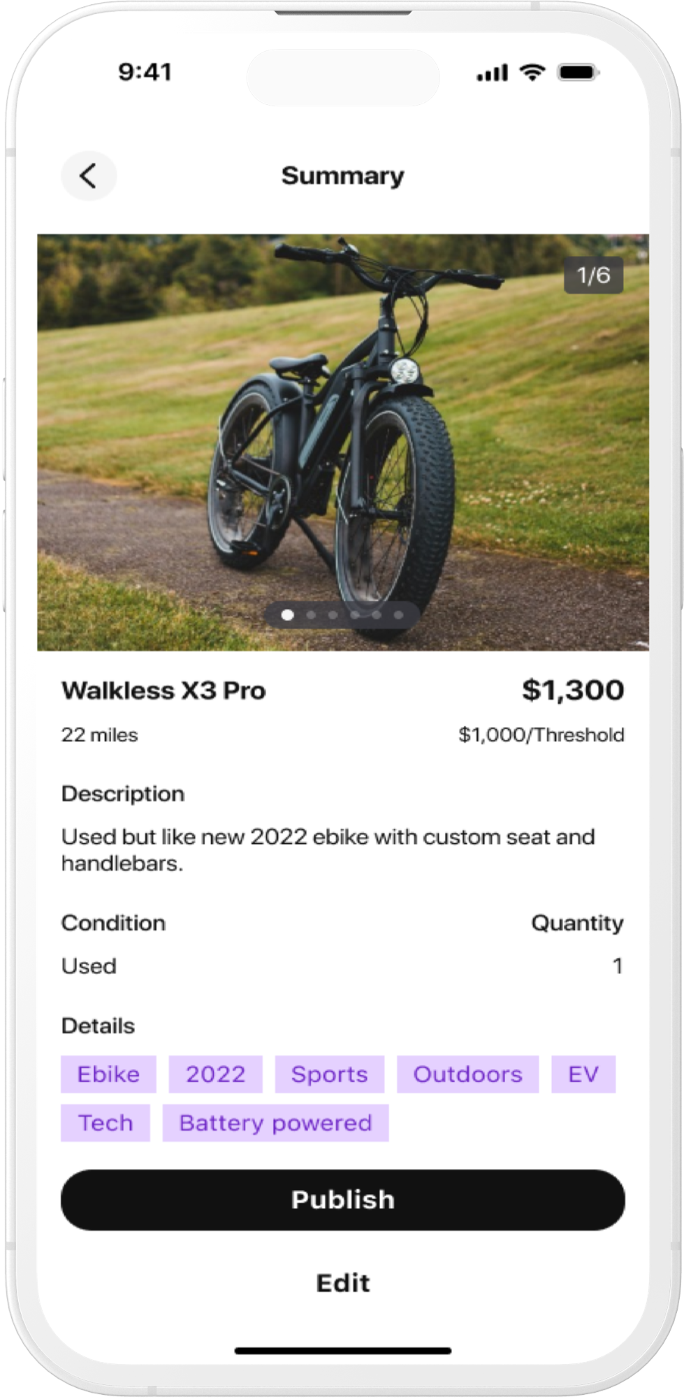
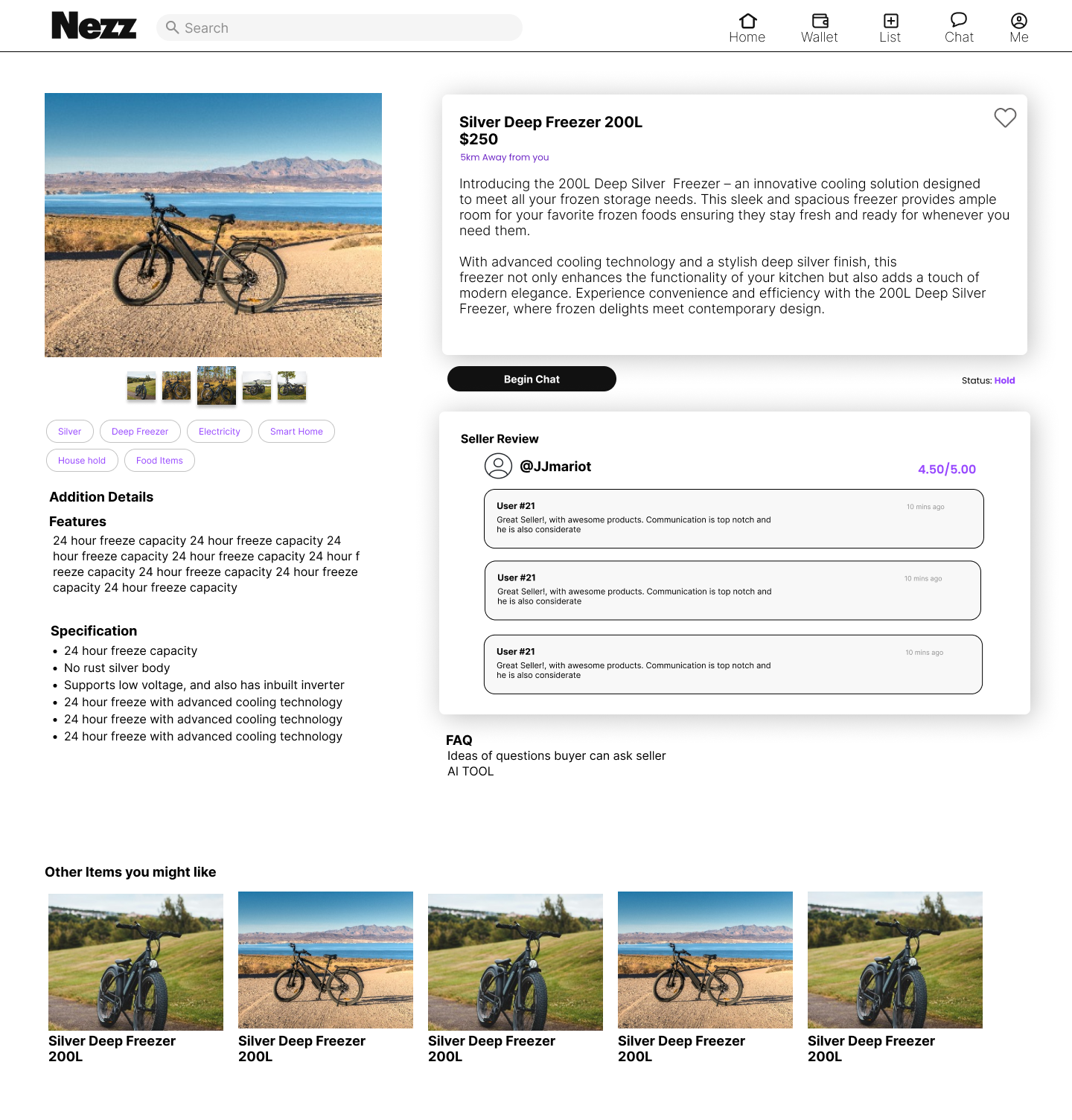
My responsibility with the client was to focus on iterating a couple of web and mobile design wireframes. I focused on a 2 web designs and 1 mobile design. Please see below for my iterations.
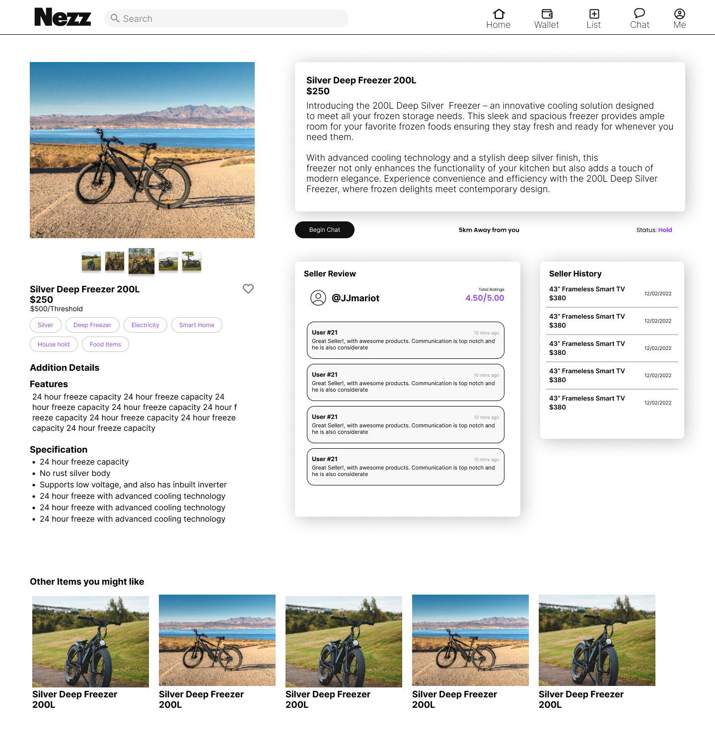
I noticed there were two areas in which the title of the product and price was placed. I moved it over to the right since most users would focus on the image first, and quickly be able to scan to the description next to the image. I also clearly place the “favorite” icon next to the description for better exposure and easy access to the user. I also spaced the wording out to give it a cleaner look. I made the seller review bigger and aligned with the product description. I also moved around the tags and the additional detail to add some padding between information.
I was given this original wireframe and told to iterate the page by cleaning up the wording and removing certain elements that did not fit the design.
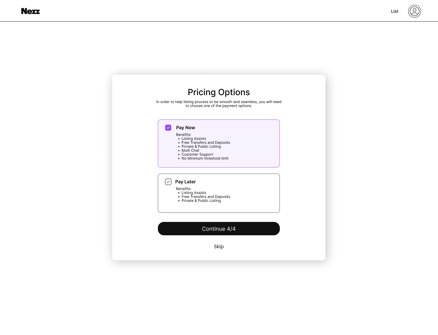
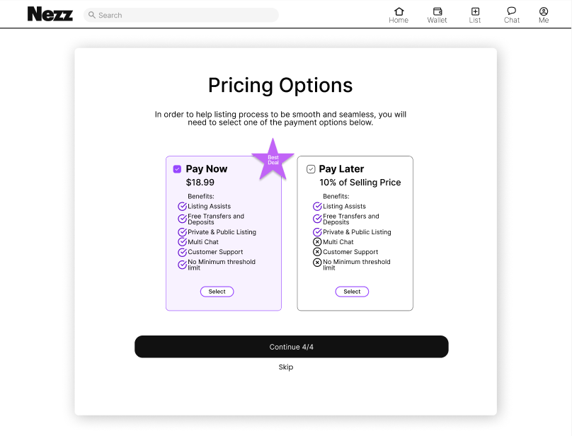
In this above task, I was asked to revamp the page to the left. I noticed the details, font, boxing, buttons were all very small. Being that this is a web design, I increased the sizing to take up more space on the page. Since this was a “Pay Now or Pay Later” page, I wanted to make sure the user could compare their options. The client wanted to me to somehow make the “Pay Now” option more appealing so I placed it vertically on the left side and placed checks on the side to show that it was the option with more benefits. The reason I update the layout to be vertical is so that the user could see the page from left to right. I also included a star to catch the attention of the user.
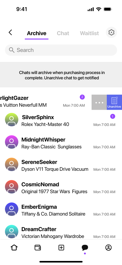
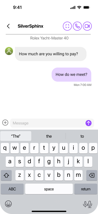
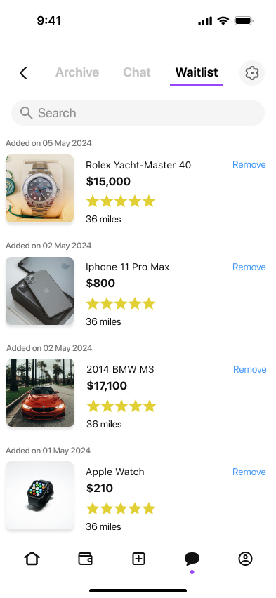
On the left is the chat screen for the mobile app. I was tasked to create a chat screen with all user chats as well a a toggle between archive, chat, and the waitlist.
The way the user flow works is that a user would purchase an item and that item gets added to a waitlist until the buyer approves. So, I also created a waitlist page in which the user could see their styles that they are waiting to purchase.
Usability Testing
To ensure that testing was standardized across participants, we created a testing plan.
Test Objectives:
Evaluate the effectiveness of Nezz's fraud detection and authentication features.
Assess users' confidence and trust in the platform's security measures.
Identify any usability issues within the app, focusing on the transaction and verification processes.
We recruited 5 participants who regularly use peer-to-peer market place with a mix of buyers and sellers. We submitted prototypes and working versions of the current project.
After our testing, we summarized some issues in our test findings.
Two-factor authentication takes extra time.
Need for more search filters to narrow down options. Enhance the UI by adding more detailed filters and sorting options to improve product discovery.
Redesign the confirmation screen to include comprehensive details about the transaction, such as order summary, delivery information, and next steps.
We also had some positive feedback on our designs:
Easy to use and made participants feel secure.
User-friendly interface and clear instructions.
Clear display of seller ratings and verification status, which reassured users about the authenticity of sellers.
Key Takeaways
We were given a pretty tight 4 week deadline for this project since the company wanted to integrate new features by a specific date. I have 2 key takeaways:
Time management and a solid/detailed project plan is key to making sure you meet your deadlines in a timely manner.
It is important to remind stakeholders and the team what the project goals are once they are established with the team.
