House 2 Home
Overview
A GV Design Sprint Challenge to create a home decor shopping experience.
House2Home, a startup specializing in affordable home decor solutions, operates an e-commerce platform offering a range of decor accessories including prints, posters, lighting, and small accent pieces.
My Role
UI/UX Designer
Tools
Micro, Figma
Timeline
5 Days
Design Process
Day 1: Understanding the User
Day 2: Sketch & Competitive Analysis
Day 3: Storyboard
Day 4: Prototype
Day 5: Testing
Day 1: Understanding the user
Problem
New renters and homeowners often struggle with decorating their living spaces because they can't visualize how it will look in reality compared to what they see online. While they may find decor inspiration on platforms like Pinterest, they encounter obstacles when trying to replicate those designs due to budget constraints or discrepancies in how the items appear in their own space. Users aspire to create a cozy atmosphere in their homes while staying within their financial means, but they face challenges in finding decor that aligns with their desired aesthetic and fits their budget. Some users have a clear vision for their decor but feel overwhelmed by the shopping process.
Solution
House2Home is a virtual interior design platform that allows users to upload images of their living spaces and overlay different decor items from various online retailers to visualize how they would look in their home.
Goal
Starting with the long-term goal: The objective is for each user to craft their ideal living space through the app. This entails finding budget-friendly items that contribute to their dream aesthetic, fostering a cozy environment. However, several challenges may arise:
Budget limitations: Users might face difficulty if desired items exceed their budget. Potential solutions include providing affordable alternatives or flexible payment options.
Concerns about satisfaction: Users may worry about not liking purchased items once they're in their space. Addressing this could involve offering hassle-free return or exchange policies to boost confidence in their choices.
Ensuring quality: Building trust in product quality is essential. This can be achieved through detailed product descriptions, user reviews, and clear visuals. Partnering with reputable brands or offering quality guarantees can also enhance users' confidence in their purchases.
How might we
How might we assist users in envisioning their ideal space?
How might we aid users in determining their desired ambiance and style?
How might we spur users to enhance their home decor?
How might we facilitate visualizing decor elements in combination?
How might we streamline the shopping journey?
How might we guide users to stay within their budget?
How might we foster an enjoyable visual journey for users?
How might we discover comparable style pieces and share them with users?
Affinity Map
User in need of home decorating assistance.
User Persona
User route
Day 2: Sketch & Competitive Analysis
competitive Analysis
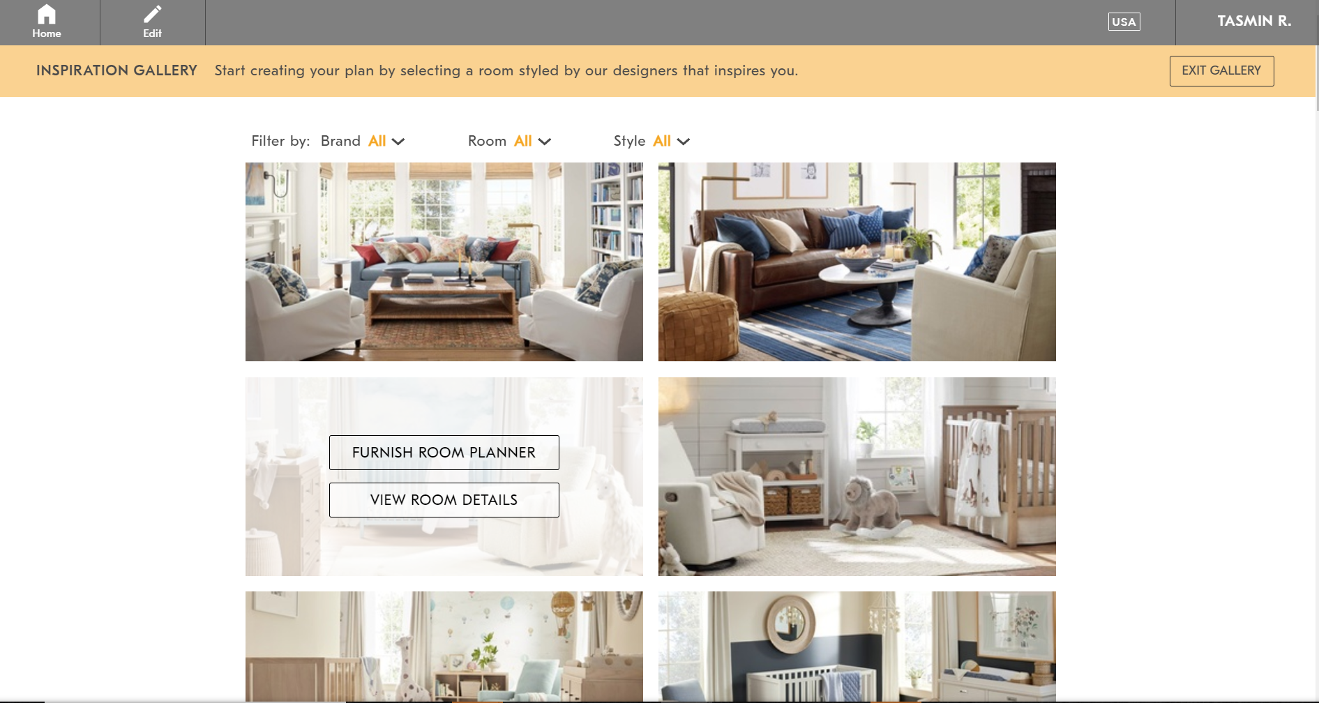
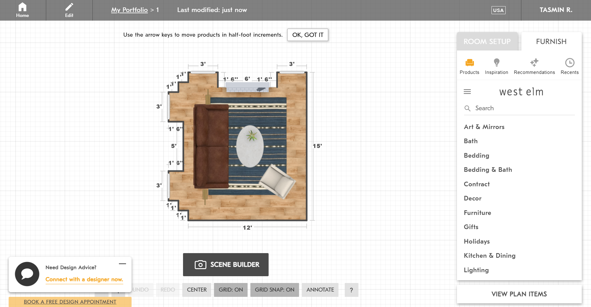
West Elm Design Crew: Room Planner
competitive Analysis
Strengths
Integration with West Elm's product catalog, allowing users to visualize and plan their space using actual West Elm furniture and decor.
Offers users the ability to see how items will look in their space before making a purchase, helping to address the issue of discrepancies in appearance.
Provides users with design inspiration and guidance through interactive tools and resources.
Weaknesses
Limited to products available from West Elm, which may not suit all user preferences or budget constraints.
May not fully address the issue of budget constraints as users are limited to products from a single retailer.
Lack of personalized design assistance beyond visualization tools.
Havenly
Strengths
Offers personalized interior design services at different price points, catering to users with varying budget constraints.
Provides users with access to professional designers who can help bring their design vision to life.
Offers a curated selection of furniture and decor from various retailers, giving users more options to choose from.
Weaknesses
Services may be perceived as more expensive compared to DIY solutions like West Elm Room Planner.
Users may experience longer turnaround times as they rely on designer availability and coordination.
Limited to virtual design assistance, which may not fully address the issue of users feeling overwhelmed by the shopping process.
Nordstrom Stylist Feature
Strengths
Leverages Nordstrom's extensive product catalog to offer users a wide range of clothing and home decor options.
Provides users with personalized styling recommendations based on their preferences and budget.
Offers users the convenience of shopping for clothing and home decor in one platform.
Weaknesses
Focuses primarily on fashion styling, with home decor being a secondary offering.
Limited to products available from Nordstrom, which may not cater to all user preferences or budget constraints.
May not provide the same level of design guidance or visualization tools as dedicated interior design platforms like Havenly.
Crazy 8’s
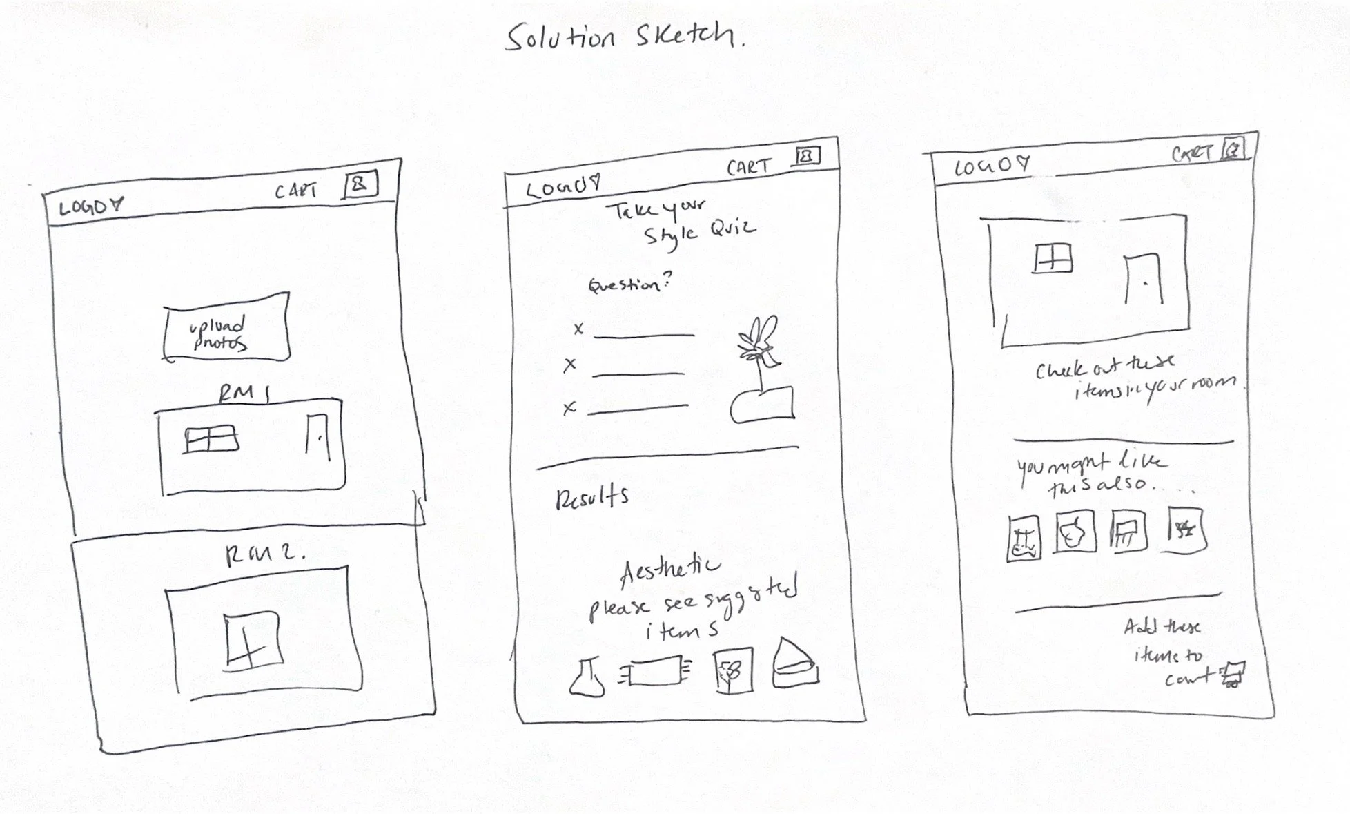
I prioritized the uploaded photo of the room page as it emerged as the most critical during interviews, given the challenges users faced there and its significance for House 2 Home. With the company's emphasis on crafting a "starter kit," my focus was on devising a streamlined process wherein users could first choose upload a photo of the room, take a style quiz of their preferred style, followed by selecting individual items within that style. Various approaches were considered, such as picking from pre-styled room photos or directly from the chosen style. Upon navigating through categories like wall art, prints, and small decor items, users would encounter their selected items compiled visually, allowing them to assess their coherence. Integrating a visual element into the product selection process added interactivity, responsiveness, and immediacy, enabling users to gauge their preferences instantly. Witnessing their envisioned space taking shape in real-time was not only engaging but also empowering for users. The preceding page prompts users to identify the style that resonates most with them, while the subsequent page showcases their chosen items in a comprehensive display, accompanied by a summary below, providing a holistic view of their selections.
Shortly after identifying the most pivotal screen, I proceeded to draft a three-panel board illustrating the screens preceding and succeeding the critical screen, namely the shopping cart page
Day 3: Storyboard
Production Solution Storyboard
Below is a scan of my storyboard sketches for designing the "Envision the products in your space" feature.
Day 4: Prototype
Creating prototypes is one of the best parts of product development for me because it brings the project's concepts to life and lends them a tangible form. I encountered a challenge in resisting the urge to perfect every aspect of the prototype and instead prioritizing the primary objectives of the user experience.
I began by reproducing the home page based on the prompt and featuring the Start project call to action in order to envision your space interaction. Subsequently, users were prompted to take a style quiz, facilitating the presentation of items tailored to their preferred aesthetic. To ensure clarity in style selection, I displayed products to show a clear customer centric product recommendation
Upon taking a style quiz, users were directed to a preview page where they could add items to their uploaded photo for their space and visualize them within a simulated space. This functionality empowers users to experiment with various items, fostering a sense of control and confidence in their purchasing decisions. Moreover, it offers an engaging interactive experience.
Users could add their selected items into a cart. Finally, they could review their selections in the cart before proceeding to checkout.
Rapid Prototyping: I initiated the development of essential screens and interactions according to the storyboard sketches in preparation for the upcoming usability tests.
Objectives:
Assessing the user's ability to seamlessly add the starter kit to the cart.
Identifying any significant usability hurdles.
Gauging users' initial perceptions of the Design Assistant.
Key Considerations:
Was the layout clear and easily navigable?
Did any points in the process feel unnecessarily intricate or confusing?
Day 5: Testing
I recruited 5 participants and conducted 4 remote usability test sessions via google meets and 1 in person. Participant Demographics: 3 Male and 2 Female, all between the ages of 25-35. Three out of the five participants had moved into a new apartment in the past two years and the remaining two participants moved into a new apartment in the last year. The interviewees enjoyed the process of building their own room with items they’d like to see and said it was very useful in helping to decorate their space. The users also went through the prototype flawlessly, except for not knowing exactly which buttons were functioning. This was due to the sprint and lack of complete prototype animation. However, they were pleased with how straightforward the pages were.
After testing, the most critical feedback was having more functionable components within the site and more red routes. Someone had also mentioned to make sure the grammar and lettering were of the same font/size on the buttons and style quiz.
Key Takeaways: Insights & Reflections
Exploring Sprint Methodology
Engaging in this five-day sprint presented a stark contrast to the longer timed project I had previously tackled. It challenged me to stretch beyond my comfort zone in various ways. Embracing the sprint framework provided a fresh Agile perspective on the design process, compelling me to brainstorm rapidly to yield swift outcomes. Undoubtedly, this aspect emerged as the most formidable hurdle.
Maintaining Focus
At times, the allure to tweak my designs was strong. However, I grasped the significance of adhering to my initial choices and persevering until completion. By staying the course, I honed in on the pivotal elements of the feature, avoiding the maze of endless ideas that collected up daily.
Future Plans
Enhancing with Micro-interactions & Animations
Given the project's scale and timeframe, integrating animations and micro-interactions was unfeasible, resulting in a prototype that feels somewhat lacking in depth. Introducing subtle animations and micro-interactions promises to infuse personality and dimension into the overall user experience.


