Overview
Envibe: A Case Study
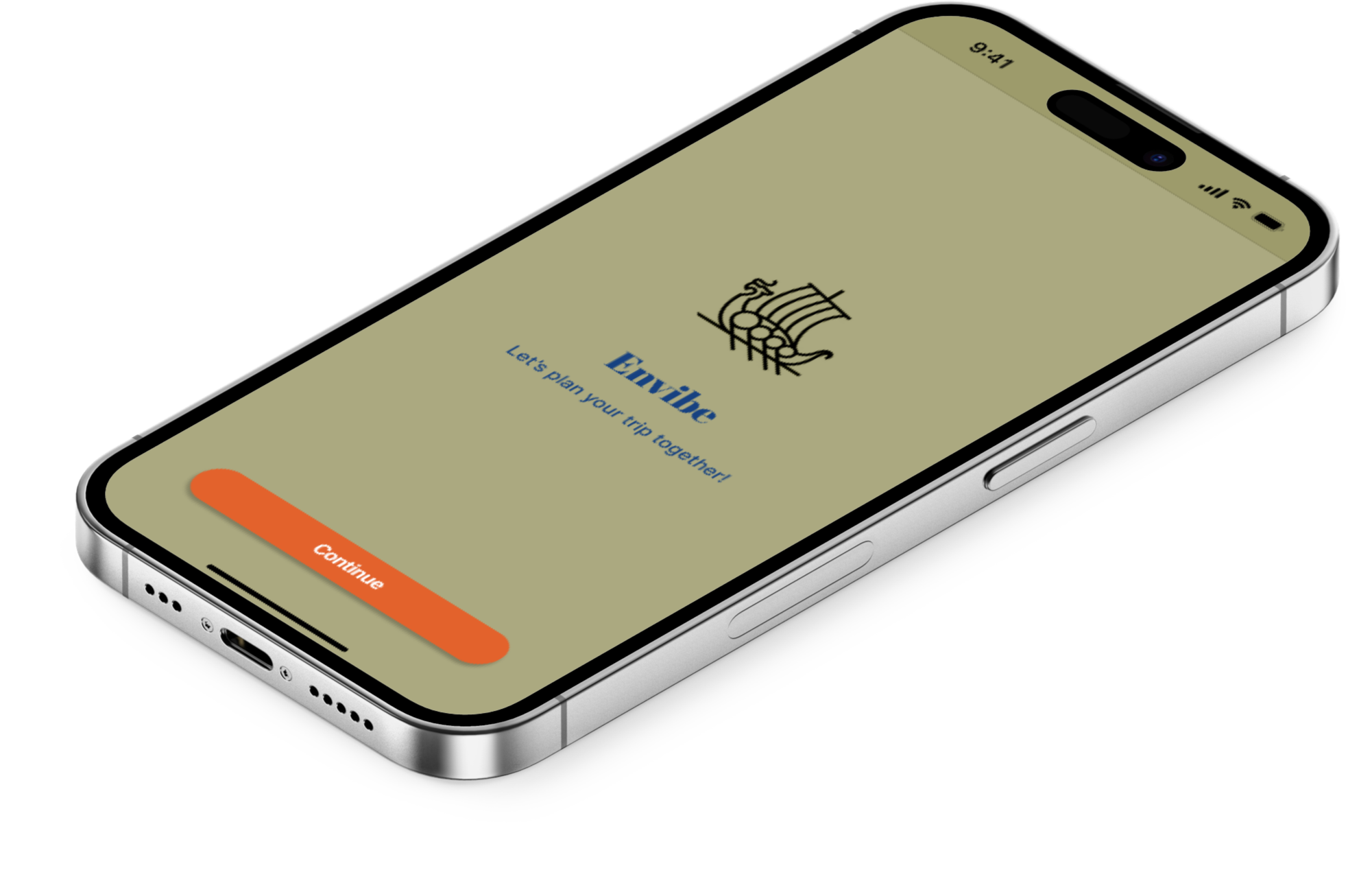
EnVibe is like a social media platform but just for travelers. You can share your past trips there and see where other people have been. It's handy because it helps you plan your own trips better. I really enjoy exploring new places, so I spend a lot of time researching and planning my trips. I make these colorful, detailed plans that not only help me remember what I want to do but can also help others who want to visit the same places. Because I've traveled quite a bit, my friends often come to me for advice when they're planning trips. They know I've been there, done that!
Planning trips can be overwhelming for some people. So, with EnVibe, I want to make it easier for everyone by sharing my experiences and tips.
My Role
UX Researcher, UX Designer, UI Designer
Key Skills
Heuristics Analysis, Ideation, Interviews, User Stories, Personas, Sketching, Information Architecture, Workflows, Wireframes, Visual Design
Tools
Figma, Micro, Marvel, Overflow
Secondary Research
I researched different resources on Google Scholar, Journals, and Travel Blogs. I used the below paper to understand challenge travel itinerary planning.
Summary: The paper addresses the challenge of interactive itinerary planning for travelers, aiming to streamline the process of selecting Points-of-Interest (POIs) and organizing them into personalized itineraries. Existing services lack interactivity and personalization. The proposed approach involves iterative steps: the user provides feedback on suggested POIs, the system recommends itineraries based on this feedback, and selects new POIs for further feedback. This process continues until the user is satisfied. The paper outlines challenges in designing such a system, including defining POI feedback models and itinerary scoring semantics. Planning a trip itinerary in a city requires significant effort, including selecting Points-of-Interest (POIs), determining their visitation order, and factoring in travel time between them. While numerous online services assist with itinerary planning, none offer an interactive interface allowing users to provide feedback and iteratively customize their itineraries based on personal interests and time constraints.
S. Basu Roy, G. Das, S. Amer-Yahia and C. Yu, "Interactive itinerary planning," 2011 IEEE 27th International Conference on Data Engineering, Hannover, Germany, 2011, pp. 15-26, doi: 10.1109/ICDE.2011.5767920. keywords: {Planning;Computational modeling;Semantics;Algorithm design and analysis;Approximation algorithms;Probabilistic logic},
Primary Research
I conducted interviews with five individuals, ensuring they were regular travelers and moderately proficient with technology through a screening process. Each interview lasted approximately 30 minutes, during which I inquired about their previous vacation experiences and their typical approach to vacation planning. This aimed to gain insight into the motivations and methodologies behind their travel planning.
Some of the main constraints were:
Having an abundance of travel information available online, it is overwhelming with the sheer volume of options for destinations and planning itineraries.
It is time consuming to plan a comprehensive itinerary in order to find the best deals, activities and accommodations with different individual preferences and budget constraints.
The toggling between multiple websites, apps and platforms to get information tends to overwhelm individuals.
Tailoring the itinerary to suit the individuals' preferences, interests, and travel styles.
Communication and collaboration can be challenging.
Following the interviews, I engaged in empathy mapping, affinity diagramming, user personas and user story creation to identify a central theme in the users' travel planning methods.
Empathy Map
Affinity Map
User Persona
User Flow
How Might We Questions
How might we ease everyone’s travel planning experiences
How might we reduce the number of platforms we use to generate an efficient itinerary
How might we use social media to develop efficient travel planning strategies
How might we play a more active role in our trip planning
How might we collaborate more often on planning for trips
How might we bridge the gap between social media and trip advisor applications
How might we reduce the amount of time we spend on itinerary creation
How might we use AI to generate the best itinerary
How might we create an environment in which we can share our travels without having to share our personalities
Competitive Research
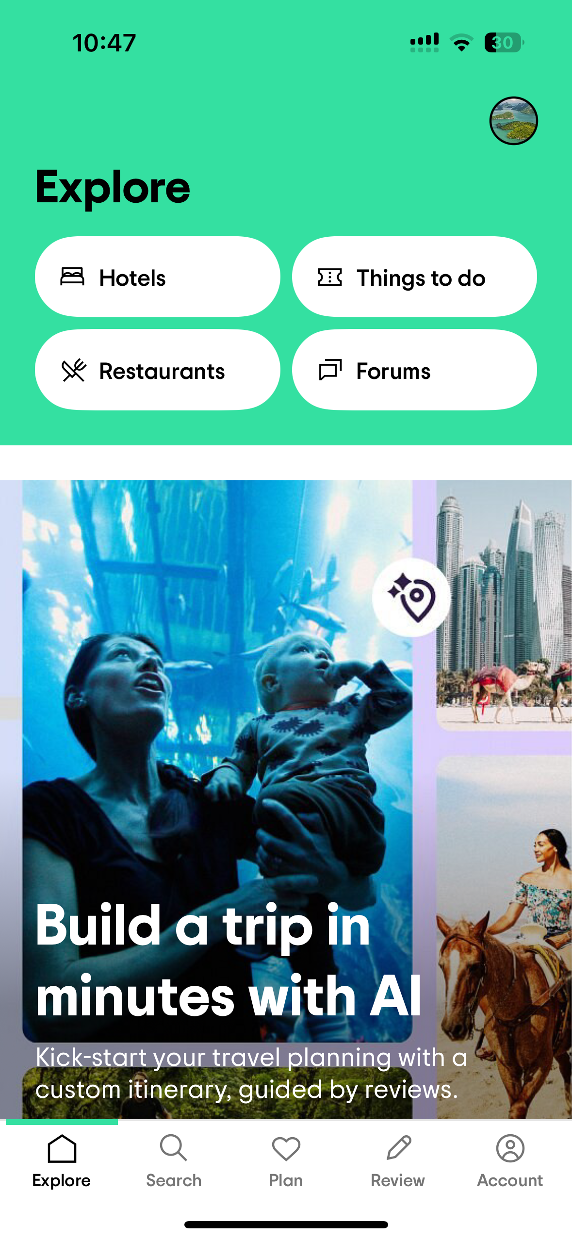
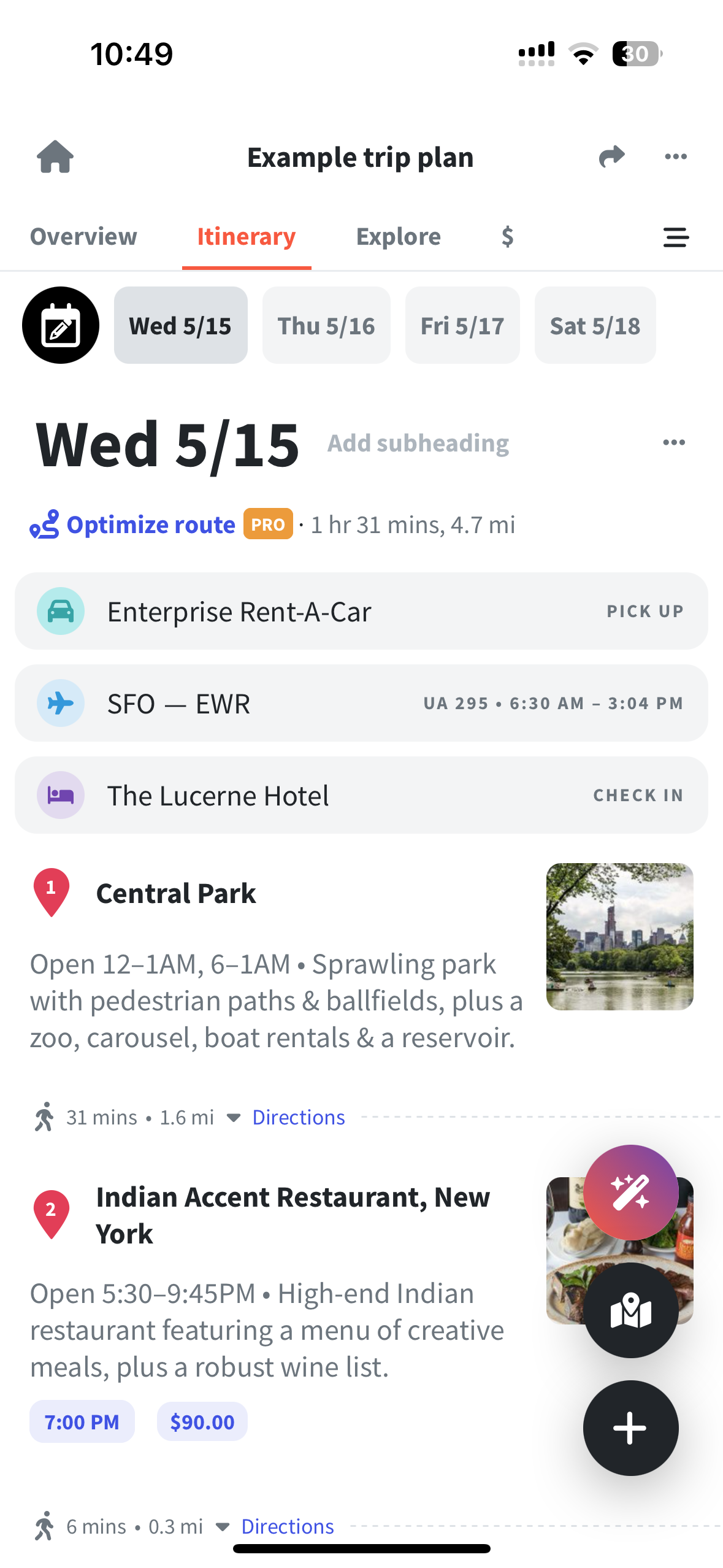
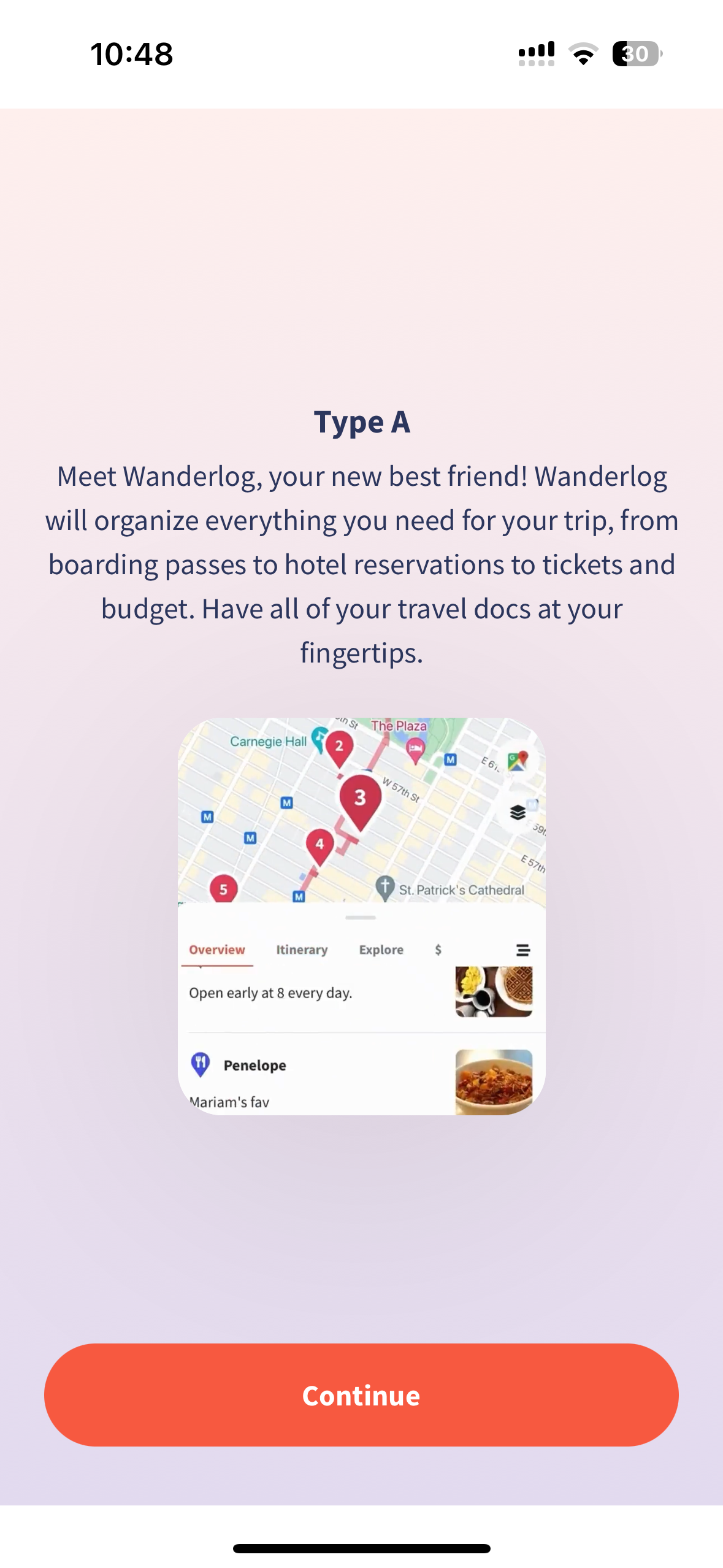
Presented below is a heuristic analysis of the product services offered by TripAdvisor, Wanderlog, and TripIt. These established websites and mobile apps serve as benchmarks within the realm of travel planning and sharing platforms. Delving into the strengths and weaknesses of these competitors provided invaluable insights that guided the formulation of innovative solutions.
Sketches
Wanderlog:
Wanderlog maintains good visibility of system status through loading indicators and real-time updates, ensuring users are aware of changes during itinerary creation. It accurately represents real-world travel experiences, providing relevant and up-to-date information to users. Offering extensive user control and freedom, Wanderlog enables itinerary customization, note addition, and collaboration. Consistency in design and layout ensures a cohesive user experience across devices. Error prevention features, such as validation checks and alerts, minimize user errors and frustrations. Recognizable features within the interface reduce the need for recall, enhancing usability. Wanderlog's flexibility and integration with travel booking platforms streamline itinerary planning. Its clean and minimalist design enhances usability and readability.
For the MVP, the user needs to be able to create, edit, and view an itinerary. On the backend, Envibe needed the data to provide a personalized itinerary I focused on 2 key principles to create an intuitive experience: personalization and collaboration. Since the the main attraction to the app would be the trending itineraries that users would be able to view on the homepage, I wanted to focus around that screen. I played with different navigation ideas with the profile being in the navigation bar or accessible only through trending itineraries. However, I wanted the app to feel more like social media more than anything to have that effective usage. So I focused my sketches alongside a social media app of sharing and creating travel experiences.
Tripadvisor:
Tripadvisor excels in providing clear visibility of system status through loading indicators and progress bars, ensuring users stay informed during searches and itinerary building. Its interface effectively mirrors real-world travel experiences, fostering user understanding and engagement. Offering extensive user control and freedom, Tripadvisor allows customization of searches, results filtering, and itinerary personalization, enhancing user satisfaction. Consistency in layout, navigation, and design elements across different sections ensures a seamless experience. The platform incorporates error prevention features like validation checks and clear feedback, minimizing user frustrations. Recognizable features and functions reduce the need for recall, while the platform's flexibility caters to diverse user needs. Its minimalist design prioritizes essential information, reducing cognitive load.
TripIt:
TripIt effectively communicates system status through loading indicators and real-time updates, ensuring users are informed of itinerary changes and travel alerts. It closely mirrors real-world travel experiences, organizing trip details in a structured and intuitive manner. Users enjoy extensive control and freedom to customize itineraries, add personal notes, and share trip details. Consistency in design and functionality across platforms ensures a seamless experience. Error prevention features like automated itinerary parsing minimize user errors. Recognizable features within the interface enhance usability. TripIt's flexibility and integration with calendars and booking platforms streamline itinerary management. Its visually appealing and minimalist design prioritizes essential trip information for clarity and conciseness.
Low Fidelity Wireframes
Guerilla Usability Testing
Moodboard
Style Guide
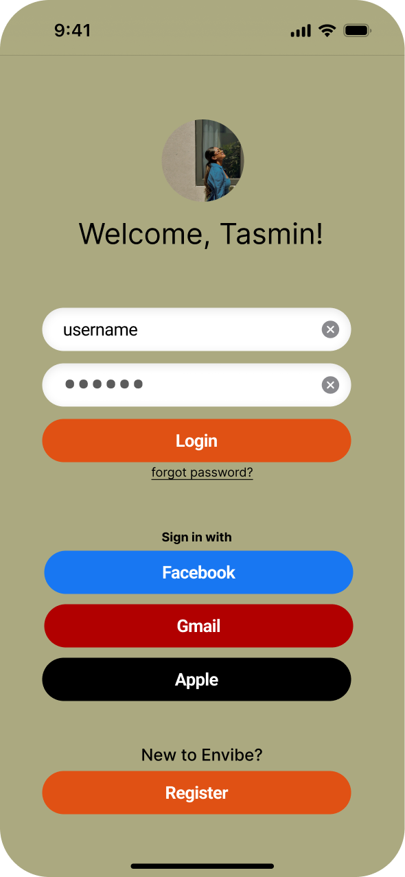
High Fidelity WireFrames
After wireframing, I created a Mood Board bursting with vibrant colors, whimsical illustrations, and dreamy landscapes, all embodying the essence of EnVibe, the revolutionary travel itinerary planning app. EnVibe is not just an app; it's a gateway to a whole new world of effortless exploration and boundless adventure that can be shared with anyone in the world. At the heart of EnVibe lies its intuitive platform, where travel planning transcends the mundane and becomes a joyous endeavor. With its user-friendly interface, crafting intricate itineraries is as easy as pie. But EnVibe doesn't stop there; it encourages social collaboration, inviting friends to join in the excitement of itinerary creation. I chose happy and exciting colors to picture yourself on a trip or adventure immediately.
Personalization is key in the EnVibe universe. Imagine receiving real-time suggestions tailored precisely to your interests, ensuring that every moment of your journey resonates with your unique vibe. Whether you're a thrill-seeker craving adrenaline-pumping escapades or a serenity seeker yearning for tranquil hideaways, EnVibe has got you covered.
Welcome to the EnVibe style guide, where we bring the spirit of adventure to life through vibrant colors and intuitive design. EnVibe is not just a travel app; it's a portal to a world of excitement and exploration. Our style guide reflects this ethos, combining bold colors, sleek typography, and user-friendly elements to create an experience that's both fun and functional. Our color palette is inspired by the richness and diversity of the world's landscapes. We've chosen a bold blue to evoke the vastness of the oceans, an olive green reminiscent of lush forests, and a bright orange that captures the warmth of sun-drenched destinations. Together, these colors create a visually striking palette that reflects the energy and vibrancy of travel.
Prototype
I interviewed five participants who were either working or casually having coffee/tea. I showed these participants my sketches and gave them a little glimpse of my idea. I asked the participants a list of questions. All participants were asked the same questions. My first question was “What do you think this app is for?” Most users on average said “This app seems to be for planning and sharing travel itineraries with friends and followers, sort of like a social network for travelers.” This was really nice to hear as it was very close to my project and users were able to tell from the start of my sketch. I also asked “Can you describe your first impressions of this app?” And someone said, “My first impressions of the app are positive. The interface looks clean and inviting, and the imagery used gives off a sense of adventure and exploration. It seems like it could be a fun tool for organizing and documenting trips.” Most participants had also answered the question of how likely they were to use this app. Being that a lot of the participants were travelers, they mentioned they are very likely to use this app often. A lot of users love travel and following travel via social media so they said it would be a great interactive app. Participants also mentioned the main features and navigation of the app were relatively easy to understand. A feature a lot of participants had questioned about and wanted to see more of was collaboration. The sketching did not really exemplify how users would interact with each other in real time and collaborate on projects. There was no indication such as a share button that would allow users to collaborate. Some participants also had said the app page was very wordy, and could be more simple with a little more space in between icons and categories.
Final Thoughts & findings
The usability testing conducted on the EnVibe prototype revealed valuable insights into its functionality and user experience, contributing to a comprehensive understanding of its potential in revolutionizing travel planning. I did 2 rounds of usability testing with 5 different participants each round. Here are the key conclusions and findings drawn from the participants' feedback:
Existing Challenges in Travel Planning- Despite the wealth of travel information available online, participants expressed ongoing struggles with the cumbersome task of planning comprehensive itineraries. Current platforms lack cohesion, leading to fragmented user experiences and inefficient planning processes.
EnVibe's Value Proposition- EnVibe aims to address these challenges by providing a social media travel platform that streamlines the discovery, organization, and sharing of travel itineraries. Its goal is to empower users to effortlessly plan and navigate their journeys with confidence and ease.
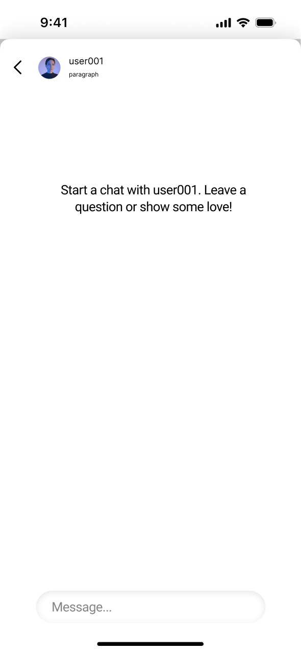
Positive User Feedback- Participants across diverse demographics positively evaluated EnVibe's usability and features. They found the process of discovering travel itineraries straightforward, appreciated the intuitive saving mechanism, and enjoyed the seamless sharing process, especially through direct messaging.
Areas for Improvement- While participants generally lauded EnVibe's user-friendliness and collaborative features, some suggestions for improvement were identified. These included adding more visual elements to search results, incorporating budget-friendly travel options, providing the ability to create custom itineraries from scratch, and enhancing collaborative itinerary editing among friends.
Future Enhancements- Suggestions for future enhancements included integrating sorting features for itineraries, enabling export to PDF for offline use, and integrating with calendar apps for scheduling, aligning with participants' preferences for enhanced functionality and convenience.
In summary, the findings from the usability testing underscore EnVibe's potential to address the pain points associated with travel planning while highlighting areas for refinement and further development. By leveraging user feedback and implementing iterative improvements, EnVibe can strive towards its mission of offering a seamless and collaborative travel planning experience for users worldwide. In short, the test results show that EnVibe has a lot of promise in solving the problems people face when planning trips. It also shows areas where EnVibe can get better. By listening to users and making small improvements over time, EnVibe can work towards its goal of making travel planning easy and fun for everyone around the world.

